I have been working on updating the look of my site and the new "me" went live today!
The address is still the same www.lindabeachartquilts.com and my blog is still listed under my website on the home page, but the new look necessitated a new blog.
I hope those of you who have followed me at this blog will continue to follow me on my new blog and bear with my while I learn the "ins and outs" and get settled in. I promise to pick up where I left off on this blog and the current project very soon.
The new blog can be found by going to my website and following the link on the home page. Hope to see you there! Thank you, Linda
Thursday, August 29, 2013
Friday, August 23, 2013
Lost in the Landscape

Figuring out what fabrics should make up the focal point or the darkest and lightest value areas is somewhat easy. Those are the kind of major decisions that I usually figure out in my initial thumbnail sketches.
But once you've placed the fabric for all those areas on your design wall, what is left is usually medium value background spaces to fill in. And, just because they are background areas, that doesn't make them any less important than the rest of the project.
 While I don't want these areas to become "center stage", I do want them to be of interest, to provide added detail. So I stare at my fabric and try to figure out what should go where. While I usually like to choose, cut and pin several pieces of fabric at a time to my design wall, sometimes in these situations I just have to find my way one careful piece at a time.
With any luck, as I am carefully finding my way one piece at a time, suddenly the way becomes clear and things start falling into place!
Friday, August 16, 2013
Assigning Values


Value can make or break your work so I always try to be very careful in thinking through where my values are going to be when I start a piece.
This project is one where I need to be especially careful when choosing fabrics to represent different values. With the mostly monochromatic color scheme, it would be very easy to have everything join together in one confusing mess if there weren't clear differences in the values of the fabrics.
I am starting with my lightest values first and placing them where they will form a path down from the blue area. I also want a few light values in some of the bushes in the foreground. You can see in the photo above where I've selected a floral fabric with light flowers on it to represent my "bushes".
With my light values established, I can now start filling in the rest of the ground area and concentrate on variety and texture without worrying about value anymore.
Monday, July 29, 2013
Adding the forest foliage


I took a look at my fabric stash for fabrics that suggested (to me at least!) pine tree foliage, branches, etc.
 I did not want to add any strong green color as I am aiming for a fairly monochromatic color scheme, so that narrowed my choices down a bit. Seems like every perfect pattern I found was in a bright green.
 I finally found these three fabrics in my stash that are very muted browns and grays and in patterns that were exactly what I wanted. I really love using plaids and this particular one I was able to "fussy" cut along the defined linear lines to suggest more branches in the overhead foliage.
 I'm very happy with the end result, looking at the pieces pinned on my design wall - just the effect that I wanted!
Sunday, July 21, 2013
Auditioning
 It's fun to work through the easy decisions on any project - the decisions that just seem to come spontaneously and flow naturally. So far I've done that by pinning the tree fabrics and that touch of blue sky to my design wall. Starting to fill in the rest takes a little more thought.
So I audition the fabrics by pinning them to the work-in-progress. Then I sit back at a distance and try to figure out if that foliage fabric is too dark of a value? Is the green too bright and oddly intense? Is there too much rusty orange in that one ground fabric?
Thursday, July 11, 2013
Building up the trees
 Now that I've pinned up my bright bit of sky, I want to concentrate on my trees.
  They are going to be the darkest value on my quilt and the focal point. Bearing that in mind, I want to get them on the design wall next as everything else in this piece will need to work well with those tree fabrics. And picking the tree fabrics will be fairly straightforward as well as they are all going to consist of a few varying shades of dark browns.
 So I can get a lot of different pieces on the design wall fairly quickly and start seeing things take shape!

Tuesday, July 2, 2013
My version of an assembly line
 Piecing is a fairly time consuming process so I try to be as efficient as possible. One way I do this is to cut out multiple pieces of fabric at a time. With the fabrics ironed and laid out around my studio, I'll make my selections and place the appropriate piece of freezer paper template on the chosen fabric.
 When I've made all the selections I can feel confident making, I'll take each fabric and iron on all the template pieces for that particular fabric. Then I'll go to
Then I can take each piece of fabric off the ironing board, one at a time, and trace and cut out my fabrics. And the best part? Pinning the fabric pieces to the design wall!
Friday, June 21, 2013
Taking Care of the Paperwork

I decided on which composition I liked the best, a more vertical, portrait orientation, and it will measure approximately 4 feet high by 3 feet wide. That's a fairly typical size for me, one that allows me to have fabric pieces large enough to show off their patterns.
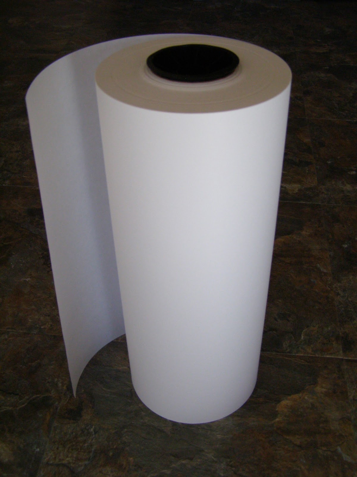
Once my pattern is finalized, I make my freezer paper templates as you can see here. I buy freezer paper in large industrial-sized rolls as I go through so much of it. And the large rolls allow me to have nice long, continuous pieces of freezer paper - handy for those extra large and long pieces.

Once I've traced all my templates, I also need to carefully label everything. With hundreds of separate pieces in one quilt, it is important to stay organized. What's the saying? A job is never complete until the paperwork is finished?
Monday, June 10, 2013
Not taking the ordinary for granted


With the sun shining on this distant spot, the trees are a brilliant lime green and the rocks and tree trunks have a rich, rusty orange color. Seen through the flat browns and olive greens in the shadowed woods in the foreground, this distant sunny spot really catches your eye. Add in a couple of trees that are silhouetted on the edge of a ridge and I started thinking about quilt possibilities......
 The first step for me is the thumbnail sketch. I was thinking of a dark monochromatic palette with a small touch of color for that distant hillside I could see. With all that dark color, though, I need to be careful that it's not too boring, that there would still be some visual interest within the darker areas.
So I sketched and sketched, thinking of tree placements, where to put that spot of color and whether the piece should have a vertical or horizontal orientation. And how big should it be?
 And, of course, what fabrics and colors should I use? I pulled these from my stash to look at while I sketched and thought. And I'm still thinking about which is best - maybe one of the last two sketches.
Monday, June 3, 2013
New Legacies: Contemporary Art Quilts
 |
| Detail, Boundaries |
I just received the wonderful news that two of my quilts, Boundaries and Banner Tree, were juried into the exhibition New Legacies: Contemporary Art Quilts.
The exhibition will open on July 9th and run through August 31st at the Lincoln Center in Fort Collins, Colorado. There will be an Opening Reception and Awards Presentation on Friday, July 12, 5-7 p.m.
Hope to see you there!
 |
| Detail, Banner Tree |
Saturday, May 25, 2013
Final photo, what's next?

Recently I picked up a beautiful art magazine to look through, one of those with lots of great eye candy. There were so many great images I decided to tear out the ones that I liked as looking at beautiful art is very inspirational for me.

Some of the images attracted me because of unusual or interesting compositions while others spoke to me because of a shape or color combination. As I assembled all of them and pinned each to my design wall I began to see a cohesive theme: color! And lots of it! So maybe the next project should have some eye-catching color to it. Either that or I have a bad case of spring fever after a long, colorless winter.
And, before I move on from the last project, here is a photo of the finished piece.
Saturday, May 18, 2013
Teaching and Traveling
As I go through my studio doing a little spring cleaning and organizing of my calendar, I realize that I have a lot of exciting teaching and lecture opportunities to look forward to! Some are favorite places I am anticipating returning to, one is a place that I have always dreamed of seeing. The engagements that stand out are:
This August I will be both teaching and lecturing at The Festival of Quilts , Birmingham, UK. As a teenager I lived in England for several years and I am really excited about returning after more years than I care to mention (I'd rather no one did the math!).
In April, 2014 I will be teaching at Art Quilt Santa Fe in beautiful Santa Fe, New Mexico which is one of my all time favorite destinations. With all of the art, the architecture and the food you can't help but enjoy time spent in Santa Fe.
And in January, 2015 I will be at the Quilt Symposium Manawatu in New Zealand, details of which should be forthcoming soon. Traveling to New Zealand has always been a dream of mine so this is a trip I am definitely looking forward to!
More information on my classes and lectures can be found on the links to each event if you think you'll be in the neighborhood. Or you can always email me if you have any questions. Now, back to that spring cleaning.......
Saturday, May 11, 2013
Quilting

Maybe it is because of the highly printed fabrics that I generally use - they don't really lend themselves to showing off intricate quilting. And I have to say that I am much more interested in the fabric combinations of my work rather than the quilted stitch.

I use a 40 wt. thread when quilting, a polyester with a bit of a sheen to it. Usually I will do specific quilted shapes for different areas, changing colors frequently. Seldom do I quilt an overall pattern across the entire piece.
I also do not mark my quilts, preferring to randomly "draw" as I go. Even when doing a line or grid pattern, I usually follow the edge of my embroidery foot when doing free-motion quilting or the edge of a seam and then build upon those lines.
 As you can see by these photos of the back of my quilt, I also don't worry about having my bobbin thread match the backing fabric. I much prefer to have my bobbin thread match the color of the thread that I'm using on the quilt top so that I don't have a contrasting color come up from the bottom if the tension of my free-motion quilting isn't perfect. I find that, no matter how hard I may try, there is always that bit of tension on a sharp turn or change of direction that will bring the bottom thread up slightly. Or maybe that is just indicative of my quilting skills!
Sunday, May 5, 2013
Final fabric selections
 The day that I finish selecting all the fabrics on a project is always a great day as I love seeing the whole image put together. Yes, it is a little messy with all the overlapping pieces pinned to my design wall, but it is always exciting to see it all come together. I did my usual ritual of sitting and staring, pondering and just generally looking for anything that did not seem right and then, when I was satisfied, got to work on the sewing.
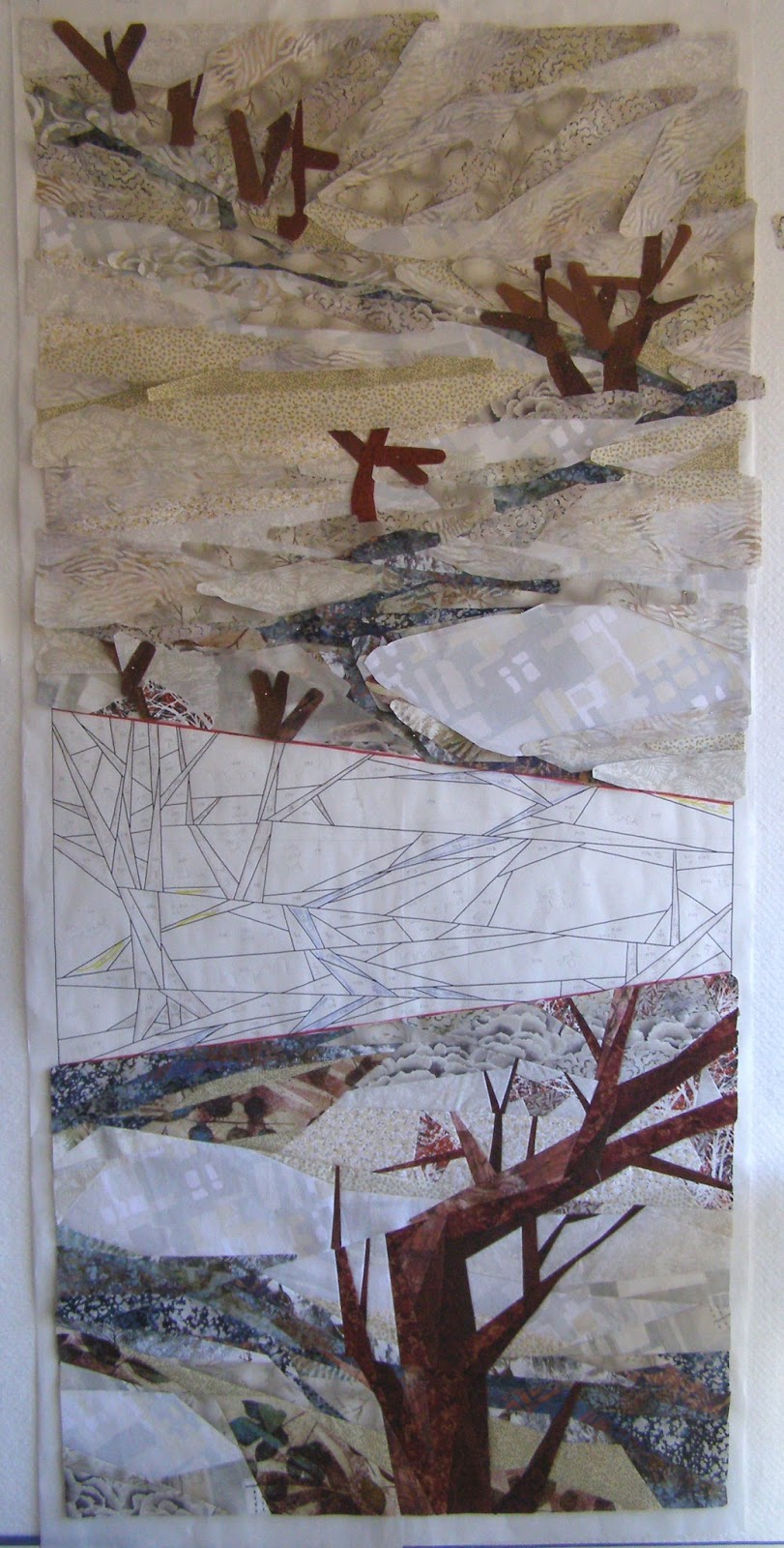

Monday, April 29, 2013
Atmospheric perspective

What is atmospheric perspective?
 Well, think about a view of a large landscape. I can look out my window and see a bit of grassy area with several trees. Farther out I can see several layers of hills and mountains all covered with more trees. On the trees close to me, I can see individual pine needles and pine cones and their color is a vibrant green. Out on the distant hills, the trees are a softer green and none of the details of the branches or pine needles can be seen. That is atmospheric perspective, the fact that color is less intense in the distance as well as the details of an object being less clear.
Off to the right you can see that I am choosing fabrics that are softer in color as well as ones that have softer edges or patterns to them. Considering atmospheric perspective gives your work much greater depth.
Thursday, April 18, 2013
Interesting Spark or Misfit?

The gray rolling "scallop" print to the left is one I've added along my river in the foreground area. I like the texture of the print but the color intensity is perhaps a little stronger than other fabrics I have already included.
 After staring at the gray scallop pinned on my design wall for a day or two, I decided to take the leap and include it in the mix. Because of the color intensity, I can't quite make up my mind if it is just the right "something" I need or an unwelcome guest that needs to go!
Here it is included in an overall view of my project so you can see the effect it has against the other fabrics for yourself. This is one I will definitely take time to step back from and try to look at it with fresh eyes another day!
Wednesday, April 10, 2013
An accent of color


My thoughts are to add areas of pale yellows, something to make you think of grasses showing though the snow as in the photo above. I went through my fabric stash and found theses three fabrics, all with similar calico patterns, that I believe will give the impression that I want.
I've added some of them to the design wall here and I think that will be enough. I especially like the way they add a little interest to that large area at the top, on the left, breaking up that large expanse of light values a little.
Wednesday, April 3, 2013
Going Towards the Light

I also have this fabulous fabric (seen here pinned to the right, on the design board) that has a cabbage-like pattern. It's got great "texture" to it but it is much more intense in color than any other fabric that I'm using and seems a little out of place. After much pondering (I really did like it and want to use it), I reluctantly took it down from my design wall and put it aside.
 With all my darker values in place, my strategy is to go to the opposite side of the spectrum and fill in my lightest value. In getting my lightest value into place and thinking of where those places might naturally fall in my landscape, I can then gradually make decisions on filling in the middle value areas between the two extremes of light and dark
.
Here's a picture of my lightest fabric. There is a great large-scale pattern overall with areas of bright white, beige and pale gray. Because the pattern is in a bit of a grid formation, I was careful to cut out my pieces randomly "on-point" so I didn't get strong vertical or horizontal lines in the final look. The fabric is so light in color that it is hard to see in the photo of the design wall, but if you look carefully you can see where I have added the first of my snow" fabrics.
Thursday, March 28, 2013
Going with the flow....


of my meandering creek, that is. Now that the trees are done, I am turning my attention to the other focus of my piece which is the creek.
My idea is to have the water and some areas immediately adjacent to it in dark values along with the dark values of the trees. I really want this creek to stand out against the background of the landscape and connect the trees in what I hope is an interesting zig-zag line.
From left to right you can see my progress as I add different blues and some darker patterned fabrics I think of as representing bushes along the water. As I add these different fabrics, I am also thinking about atmospheric perspective in that the foreground water fabrics are darker with larger patterns while the far distant water is a tone-on-tone fabric in a lighter blue.
Saturday, March 23, 2013
Larimer County Artist of the Year
I just received some very exciting news - I've been selected as Larimer County Artist of the Year for 2013!
As someone whose work is inspired by nature this is a particularly rewarding designation to have. An honor bestowed by the Larimer County Department of Natural Resources, the artist chosen is asked to create a piece of visual art inspired by a Larimer County park or open space which they will donate to the County. This artwork will then be celebrated and displayed for public viewing in a Larimer County building.
I've just been looking at the long and varied list of parks and open spaces, some I'm familiar with and others I look forward to exploring. Larimer County contains such wide and varied types of landscapes that I don't think there will be any lack of inspiration!
Sunday, March 17, 2013
Color in a winter landscape

There are several blues that I want to use for my meandering stream. Then there are a couple of other fabrics that are also a dark value with a strong print to them that I think will be perfect for bushes and shrubs along this stream. Last, but not least, I have fabrics that are variations of white and beige that will represent the snow covered patches in my landscape.
As I always like to do, I have organized all my fabrics by value. I want to make sure that my meandering stream is the darkest value (aside from the trees) across this landscape, with the edges of the water gradually receding to the lighter value of the snow covered areas. Sorting the fabrics by value now will help me in my choices as I fill in my pattern. I'll be able to group together similar values in my fabrics, making sure I avoid a "stripe" effect.
Somewhere I learned the phrase "value does the work while color gets the credit" and I've always remembered the words as they are so true. If anyone knows who can be credited with that statement, I would love to hear from you.
Sunday, March 10, 2013
My never ending search
 As someone who focuses on nature, more specifically trees, I am always on the lookout for fabrics that portray foliage. And a fabric that can portray foliage against sky is the absolute Holy Grail for me.
. Unless you are working in a very large scale, it is usually out of the question to individually piece leaves. If I did applique or fusing or some other technique, this would be an easier problem to tackle but piecing is what I enjoy. So I look for fabrics that have a light/dark value contrast even if the colors are not anything you would ever see in a real leaf or in the sky. I once did a piece that featured blue trees in a blue landscape just because I had found the perfect fabric for the foliage against the sky and that perfect fabric was in shades of blue.
When it came time to add a few leaves to my cottonwood trees in this project I chose the fabrics pictured here and drew them in random shapes. The shapes of the fabric pieces themselves definately do not resemble leaves in any way but are my impressionistic interpretation of foliage.
 Unless you are working in a very large scale, it is usually out of the question to individually piece leaves. If I did applique or fusing or some other technique, this would be an easier problem to tackle but piecing is what I enjoy. So I look for fabrics that have a light/dark value contrast even if the colors are not anything you would ever see in a real leaf or in the sky. I once did a piece that featured blue trees in a blue landscape just because I had found the perfect fabric for the foliage against the sky and that perfect fabric was in shades of blue.
 When it came time to add a few leaves to my cottonwood trees in this project I chose the fabrics pictured here and drew them in random shapes. The shapes of the fabric pieces themselves definately do not resemble leaves in any way but are my impressionistic interpretation of foliage.
Subscribe to:
Posts (Atom)