It's been a busy week and I've been thinking about my birds darting over a flowing river the whole time. Yesterday I had my first chance to go through my fabric stash and pull some likely prospects. Even though I might not have the chance to start drafting a pattern for this quilt right away, I like to make time to gather potential fabrics so I can have time to mull them over (I'm big on mulling) and do a little bit of tweaking here and there.
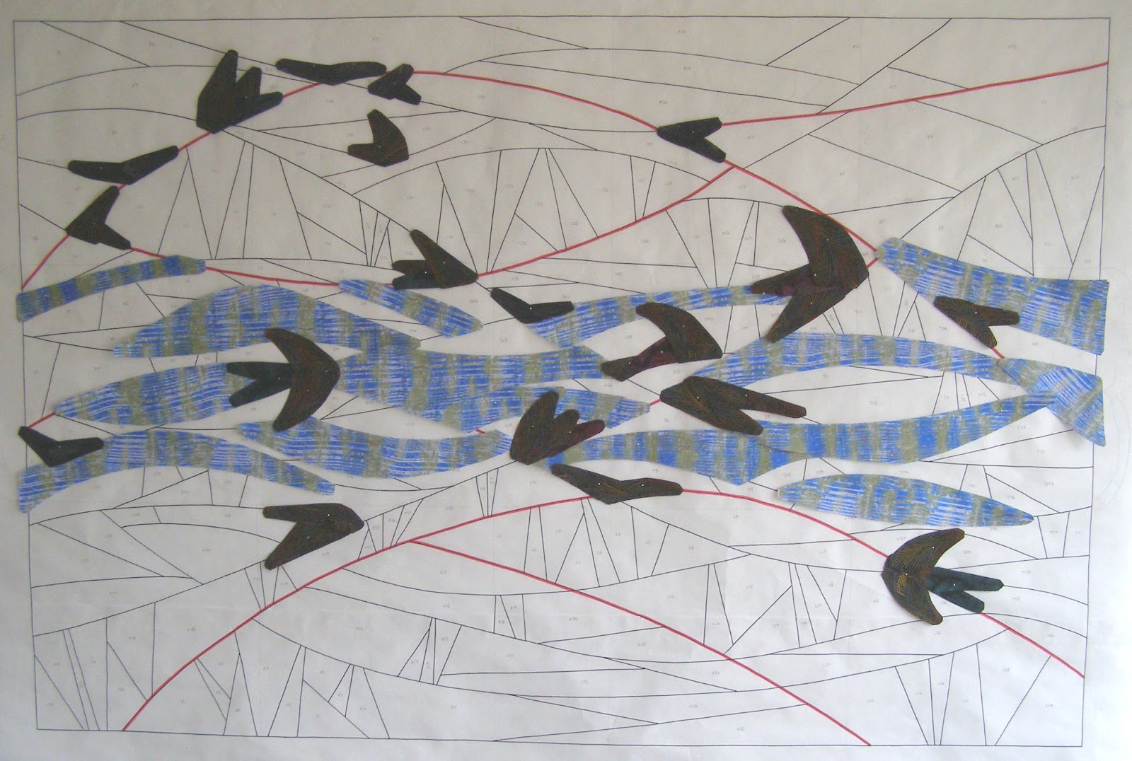
As I mentioned previously, I want to make sure that my birds will stand out against the background so it's important to establish the right values now between the birds, the river, the foliage, foreground and the sky. I believe that value trumps composition (though composition is a close second), so I need to make sure the value contrasts are good from the start. What I like to do to test this is to gather any and all fabrics that I like and arrange them vaguely in the placement they might have in the finished piece.
The blue with the linear pattern in the middle is going to be my "river" (at least for now) and I want that to have a strong presence, though not more so than the birds. The birds are going to be a very dark value so, going by that criteria, the river needs to be a middle value. The potential fabrics for the birds are folded together at the very bottom of the picture so I can judge the contrast. With those two anchors in place, I went looking for foliage, rocks/gravel and skies. You can see that I chose mostly light values for those and ones with very muted tones as well, almost neutral in color with very pale grayish blues, tans, celery and moss greens. There will probably be a little more adjusting, but I think I've got a good base to build upon for this project.

 In The Art of Combining Patterns in Cloth, I talk about my process and include several photographs of past work that illustrate my points. I was very flattered to be asked to contribute to the magazine and they've done a fabulous job with the all the images printed - the colors are gorgeous!